Declarative UI reference
45 minute read
Declarative XML is a user interface markup language defining UI elements and bindings that allows you to quickly create dialogs within Policy Studio with minimal coding.
The defined elements map to Eclipse Standard Widget Toolkit (SWT) widgets and Axway ScreenAttributes (groups of SWT widgets backed by entity instances).
This topic describes in detail the UI elements and bindings.
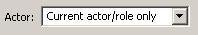
ActorAttribute
The ActorAttribute tag renders an SWT Combo widget with an optional Label. The combo box is populated with the following entry: “Current Actor/Role only”. This is the default value for SOAP requests that contain a WS-Security block, and do not contain a SOAP Actor/Role attribute. An additional value can be entered if a WS_Security block with a specific Actor/Role is contained in the SOAP message.
| Attribute | Description | M/O | Default |
|---|---|---|---|
| field | Specifies the name of the field of the entity backed by the rendered controls. | M | - |
| label | Specifies the ID of the resource containing the text to display on the Label. | O | - |
| span | Value used in the creation of layout-data for the Button. Span represents the horizontal span of the following GridData: GridData gridData = new GridData(); |
O | 1 |
| required | Specifies whether or not the entity field is required | O | false |
Sample XML\
<ui>
   <panel indent="15" margin="0">
     <ActorAttribute label="ACTOR_LABEL" field="actor" required="true" />
   </panel>
</ui>
Rendered UI\
The above XML renders the following UI:
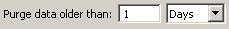
AgeAttribute
The AgeAttribute tag renders an SWT Label (optional), Text and Combo widgets, allowing you to specify a numeric age value, and select one of the following age types:
- Seconds
- Minutes
- Hours
- Days
Note
The value that is persisted to the underlying entity is stored as milliseconds.| Attribute | Description | M/O | Default |
|---|---|---|---|
| field | Specifies the name of the field of the entity backed by the rendered controls. | M | - |
| label | Specifies the ID of the resource containing the text to display on the Label. | O | - |
| span | Value used in the creation of layout-data for the Button. Span represents the horizontal span of the following GridData: GridData gridData = new GridData(); |
O | 1 |
| required | Specifies whether or not the entity field is required | O | false |
Sample XML\
<ui>
  <panel columns="3" margin="0">
    <AgeAttribute field="maxAge" label="AGE_LABEL" required="true"/>
  </panel>
</ui>
Rendered UI\
The above XML renders the following UI:
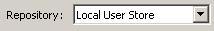
AuthNRepositoryAttribute
The AuthNRepositoryAttribute tag renders an SWT Combo widget with an optional Label.
Authentication repositories are grouped into different types and each type of authentication repository has an associated group of filter types they are compatible with. For example, “Local Repositories” instances are compatible with the following filter types:
- HttpBasicFilter
- HttpDigestFilter
- WsBasicFilter
- WsDigestFilter
- WsUsernameFilter
- AttributeAuthnFilter
- FormAuthnFilter
The Combo widget is then populated with this list of instances that are compatible with this filter type.
| Attribute | Description | M/O | Default |
|---|---|---|---|
| field | Specifies the name of the field of the entity backed by the rendered controls. | M | - |
| label | Specifies the ID of the resource containing the text to display on the Label. | O | - |
| filterType | When displaying the combo widget, only lists the authentication repositories which are compatible with this specific filter type. | M | - |
| refName | Specifies Field value of the referenced entity that will be displayed in the Combo box. | M | - |
| required | Specifies whether or not the entity field is required | M | - |
Sample XML\
<ui>
 <panel columns="2">
  <AuthNRepositoryAttribute label="REPOSITORY_LABEL" field="repository"
   filterType="FormAuthnFilter" refName="name" required="true"/>
 </panel>
</ui>
Rendered UI\
The above XML renders the following UI:
binding
The binding tag allows you to create a binding between various widgets.
| Attribute | Description | M/O | Default |
|---|---|---|---|
| driver | Specifies the name of the attributes that designate as drivers separated by commas. | M | - |
| driven | Specifies a list of attributes separated by commas to be enabled/disabled. | M | - |
| class | Specifies the name of the class that performs and controls the binding between attributes. | M | - |
| uncheckOverride | This attribute only applies when using the Enabler class. It allows the Enabler to enable controls when a ButtonAttribute is not selected and disable them when a ButtonAttribute is selected. Specify ‘enabled’ to override the default Binding behavior. | O | - |
Sample XML\
The binding below specifies a binding between a
<ui>
 <ButtonAttribute field="sortFiles" label="SORT_FILES_LABEL"/>
 <panel columns="2" margin="0">
  <panel label="SORT_TYPE_LABEL" margin="0,0,0,7">
   <ComboAttribute field="sortType"  contentSource="com.vordel.client.manager.filter.dirscan.DirectoryScannerDialog.sortType"
    includeBlank="false" readOnly="true" required="true" stretch="true" />
  </panel>
  <panel label="SORT_DIRECTION_LABEL" margin="0,0,0,7">
   <ComboAttribute field="sortDirection" contentSource="com.vordel.client.manager.filter.dirscan.DirectoryScannerDialog.sortDirection"
    includeBlank="false" readOnly="true" required="true" stretch="true" />
  </panel>
  <binding driver="SORT_FILES_LABEL" driven="SORT_TYPE_LABEL,SORT_DIRECTION_LABEL"
   class="com.vordel.client.ui.declarative.Enabler" />
 </panel>
</ui>
Rendered UI\
The above XML renders the following UI:
When the Sort files button is disabled the “Sort type” and “Sort direction” Combo boxes are disabled.
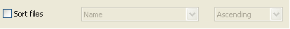
When the Sort files button is enabled they are enabled also.

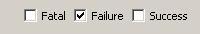
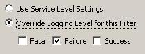
BitMaskAttribute
The BitMaskAttribute tag renders a bank of SWT Button widgets, each with the SWT.CHECK style applied, and backed by the specified entity field.
| Attribute | Description | M/O | Default |
|---|---|---|---|
| field | Specifies the name of the field of the entity backed by the rendered controls. | M | - |
| columns | Value used in the creation of the layout data for the Composite. Columns represents the number of cell columns of the following GridLayout: GridLayout gridLayout = new GridLayout(); |
O | 1 |
| required | Specifies whether or not the field is required | O | false |
Each item in the bitmask is represented declaratively as a choice tag, which is a child of BitMaskAttrbute. The following table outlines the choice attributes:
| Attribute | Description | M/O | Default |
|---|---|---|---|
| label | Label to be displayed for the check box | M | - |
| value | Integer value for this choice in the overall bitmask | M | - |
Sample XML\
<ui>
 <panel indent="15" margin="0">
  <BitMaskAttribute field="logMask" columns="3">
   <choice value="1" label="LOG_PAGE_LOG_LEVEL_FATAL"/>
   <choice value="2" label="LOG_PAGE_LOG_LEVEL_FAILURE"/>
   <choice value="4" label="LOG_PAGE_LOG_LEVEL_SUCCESS"/>
  </BitMaskAttribute>
 </panel>
</ui>
Rendered UI\
The above XML renders the following UI:
button
The button tag renders an SWT Button widget with the SWT.PUSH style applied.
| Attribute | Description | M/O | Default |
|---|---|---|---|
| label | Used internally for callback purposes to allow the extents of the scroll panel to be set correctly. If an image is not specified, the label is also used as the text of the button. |
M | - |
| image | Specifies the ID of the image to be used for the button. The ID must be specified in the images.properties file.An image takes precedence over a label, so if both are specified the image will be displayed, rather than the text. |
O | - |
| tooltip | Specifies the tooltip text. | O | - |
| style | Specifies the style of the button. Possible values are:
|
O | push |
| selected | If the style attribute is specified and the value is set to “check” or “radio”, it specifies whether or not the button is selected. Possible values are “true” and “false”. |
C | true |
Sample XML\
<ui>
 <panel columns="2">
  <button image="browse" label="BROWSE_TIP" tooltip="BROWSE_TIP" />
 </panel>
</ui>
Rendered UI\
The above XML renders the following UI:

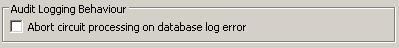
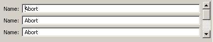
ButtonAttribute
The ButtonAttribute tag renders an SWT Button widget with the SWT.PUSH style applied, and backed by the specified entity field.
| Attribute | Description | M/O | Default |
|---|---|---|---|
| field | Specifies the name of the field of the entity backed by the rendered controls. | M | - |
| label | Specifies a textual label for the Button. | M | - |
| displayName | Specifies the name of the Button to be displayed in the event of an error. | O | - |
| span | Value used in the creation of layout data for the Button. Span represents the horizontal span of the following GridData: GridData gridData = new GridData(); |
O | 1 |
| on | Specifies the attribute value when the Button is checked. | O | - |
| off | Specifies the attribute value when the Button is unchecked. | O | - |
| required | Specifies whether or not the field is required. | O | false |
| trackChanges | Specifies whether or not changes will be tracked when the button state has changed. If set to “true” this calls the trackChange() method on the page on which the button is rendered. |
O | false |
Sample XML\
<ui>
 <group label="LOG_PAGE_ABORT_SECTION_LABEL">
  <ButtonAttribute field="abort" label="ABORT_PROCESSING_LABEL" span="2"/>
 </group>
</ui>
Rendered UI\
The above XML renders the following UI:
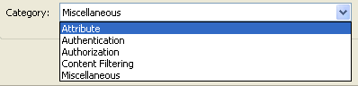
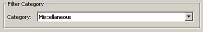
CategoryAttribute
The CategoryAttribute tag renders an SWT Combo widget with either the SWT.BORER or READ_ONLY style applied. It lists all the categories available.
| Attribute | Description | M/O | Default |
|---|---|---|---|
| label | Specifies a textual label for the Combo. | O | - |
| readonly | Specifies the style of the Combo. It can be either SWT.READ_ONLY or SWT.BORDER. |
O | SWT.READ_ONLY |
Sample XML\
<ui>
 <CategoryAttribute label="LOG_CATEGORY_LABEL"/>
</ui>
Rendered UI\
The above XML renders the following UI:
CertDNameAttribute
The CertDNameAttribute tag renders a SWT Combo with a list of certificates.
| Attribute | Description | M/O | Default |
|---|---|---|---|
| field | Specifies the name of the field of the entity backed by the rendered controls. | O | - |
| label | Specifies the ID of the resource containing the text to display on the Label (to the left of the combo box) | O | - |
| required | Specifies whether or not the entity field is required | O | false |
Sample XML\
<ui>
 <CertDNameAttribute label="ISSUER_DNAME_LABEL"
  field="issuerName" required="true" />
</ui>
Rendered UI\
The above XML renders the following UI:

Note
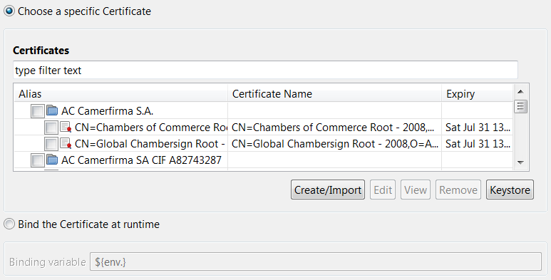
The combo box is longer in width but shortened here for clarity.certSelector
The certSelector tag renders a Label with an associated Button and read-only TextBox (which contains the alias of the selected certificate or (unset) if no certificate has been selected).
When the Button is clicked a certificate selection dialog similar to the following is displayed:
| Attribute | Description | M/O | Default |
|---|---|---|---|
| field | Specifies the name of the field of the entity backed by the rendered controls. | M | - |
| label | Specifies a textual label to appear above the table. | O | - |
| buttonOnRight | Specifies whether or not the button is rendered to the right of the widgets. | O | false |
| view | If “privateKey” is specified for this attribute the selection dialog that is displayed when the associated button is clicked will only display certificates that contain a private key. | O | - |
| required | Specifies whether or not the entity field is required. | O | false |
Sample XML\
<ui>
 `panel`
  <certSelector label="SECURITY_SERVER_CERTIFICATE" field="sslCertificate"
   required="false" view="privateKey" />
 </panel>
</ui>
Rendered UI\
The above XML renders the following UI:

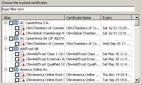
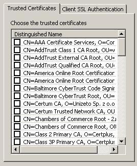
CertTreeAttribute
The CertTreeAttribute tag renders a JFace TreeViewer, populated with certificate information read from the certificate store.
| Attribute | Description | M/O | Default |
|---|---|---|---|
| field | Specifies the name of the field of the entity backed by the rendered controls. | M | - |
| label | Specifies a textual label to appear above the table. | O | - |
| multiSelect | Specifies whether or not multiple certificates can be selected in the tree. | O | true |
| keysOnly | Specifies whether or not to filter the tree and only show certificates that contain a private key. By default all certificates are displayed. | O | false |
| tableHeight | Specifies a height hint for the table. | O | - |
| required | Specifies whether or not the entity field is required. | O | false |
Sample XML\
<ui>
 `panel`
  <CertTreeAttribute label="SSL_CERTIFICATES_LABEL" field="sslUsers"
   required="false" multiSelect="false" keysOnly="true" tableHeight="300" />
 </panel>
</ui>
Rendered UI\
The above XML renders the following UI:
CheckboxGroupAttribute
The CheckboxGroupAttribute tag renders an SWT Composite with zero or more Buttons (style = SWT.CHECK) defined using choice tags as children.
CheckboxGroupAttribute attributes
| Attribute | Description | M/O | Default |
|---|---|---|---|
| field | Specifies the name of the field of the entity backed by the rendered controls. | M | - |
| columns | Value used in the creation of layout data for the Composite. Columns represents the number of cell columns in the layout: GridLayout layout = new GridLayout(); |
O | 1 |
| required | Specifies whether or not the entity field is required. | O | false |
choice attributes
| Attribute | Description | M/O | Default |
|---|---|---|---|
| label | Specifies the ID of the resource containing the text to display on the Label. | M | - |
| value | Specifies one of the possible entity values for the ‘field’ defined in the CheckboxGroupAttribute tag. This value is tied to the button, and saved to the Entity if this button is selected. | M | - |
| span | Value used in the creation of layout data for the Button. Span represents the horizontal span of the following GridData: GridData gridData = new GridData(); |
O | 1 |
Sample XML\
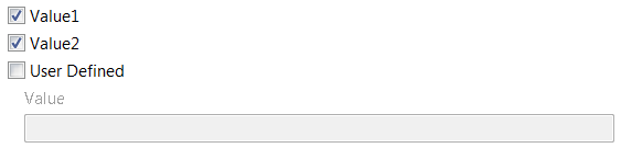
The following example represents the multi-valued “options” entity field, of which there are three possible values: “value1”, “value2”, and “custom”.
- If the first check box button is selected (represented by the first
choicetag) the “options” acquire the value “value1”. - If the second check box button is selected the “options” acquire the two values: “value1” and “value2”.
- If all three check boxes are selected the “options” acquire all three values: “value1”, “value2” and “custom”.
The CheckboxGroupAttribute tag is not restricted to having only choice tags as children. A good candidate is the panel container tag, as outlined in the example below. When the ‘User Defined’ choice is selected the children of the subsequent panel are enabled automatically. When the ‘User Defined’ choice is unselected, these children are disabled automatically.
    <ui>
        `panel`
            <CheckboxGroupAttribute field="options" label="Select Values">
                <choice value="value1" label="Value1" />
                <choice value="value2" label="Value2" />
                <choice value="custom" label="User Defined" />
                    <panel indent="15" margin="0">
                        <TextAttribute field="custom" label="Value"/>
                    </panel>
            </CheckboxGroupAttribute>
        </panel>
    </ui>
Rendered UI\
The above XML renders the following UI.
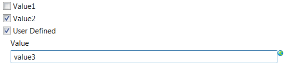
The multi-valued “options” entity field has two values: “value1” and “value2”:
The multi-valued “options” entity field has two values: “value2” and “custom”:
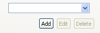
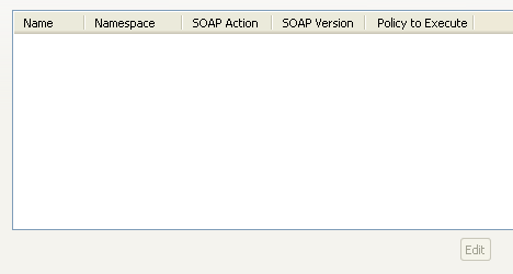
CircuitChainTable
The CircuitChainTable tag renders a Table widget. The table is populated with the field values of the backed entity.
| Attribute | Description | M/O | Default |
|---|---|---|---|
| flavor | Specifies the type of entity that is backed by each Table entry in the rendered controls. | M | - |
| setOrderable | Specifies whether the table has up and down buttons to traverse the entries. | O | true |
| setCapabilities | Specifies the CRUD capabilities that are allowed. They are separated by a comma [ADD, EDIT, DELETE] | O | - |
Sample XML\
<ui>
  <CircuitChainTable flavor="OperationCircuitReference"
   setOrderable="false" setCapabilities="EDIT"/>
</ui>
Rendered UI\
The above XML renders the following UI:
ComboAttribute
The ComboAttribute tag renders an SWT Combo widget, backed by the specified entity field.
| Attribute | Description | M/O | Default |
|---|---|---|---|
| field | Specifies the name of the field of the entity backed by the rendered controls. | M | - |
| contentSource | Specifies a string array (Java String[]) or map (Java Map<>) with which to populate the combo box. | M | - |
| label | Specifies a textual label to appear to the left of the Combo | O | - |
| includeBlank | Specifies whether or not a blank item should be added as the first item to the combo box | O | false |
| readOnly | Specifies whether or not the combo box is read-only; that is, whether or not the user can enter their own value as well as select from the drop-down list. | O | false |
| required | Specifies whether or not the entity field is required | O | false |
| stretch | Specifies whether or not the combo box stretches to fill the available horizontal space | O | false |
Sample XML\
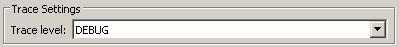
<ui>
 <group label="TRACE_SETTINGS_LABEL" columns="2" span="2">
  <ComboAttribute field="traceLevel" label="TRACE_LEVEL_LABEL"
   required="true" readOnly="true"
   contentSource="com.vordel.client.manager.filter.util.TraceHelper.logLevels" />
 </group>
</ui>
Rendered UI\
The above XML renders the following UI:
comboBinding
The comboBinding tag allows you to create a binding between various widgets.
| Attribute | Description | M/O | Default |
|---|---|---|---|
| driver | Specifies the name of the ComboAttribute that designates as the driver. | M | - |
| driven | Specifies a list of Attributes separated by ‘,’ to be enabled or disabled. | M | - |
| class | Specifies the name of the class that will perform and control the binding between attributes. | M | - |
| valueSelected | Designates the value to be initially selected. | M | null |
| enableDriven | Specifies by default where the attributes will be enabled or disabled on startup. | O | true |
Sample XML\
The binding below specifies a binding between a ComboAttribute and a TextAttribute.
<ui>
 <ComboAttribute field="extractMethod"
  label="JMS_CONSUMER_EXTRACTION_METHOD_LABEL"
  contentSource="com.vordel.client.manager.filter.jms.JMSConsumerDialog.extractMethods"
  includeBlank="false" readOnly="true"
  required="true" stretch="true"/>
 <TextAttribute field="attributeName"
  label="JMS_MESSAGE_ATTRIBUTE_NAME"
  required="false"/>
 <comboBinding driver="JMS_CONSUMER_EXTRACTION_METHOD_LABEL"
  driven="JMS_MESSAGE_ATTRIBUTE_NAME"
  class="com.vordel.client.ui.declarative.ComboEnabler"
  valueSelected="1" enableDriven="false"/>
</ui>
Rendered UI\
The above XML renders the following UI:

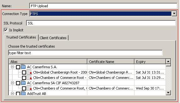
ComboStackPanel
The ComboStackPanel tag primarily renders an SWT Combo widget, backed by the specified entity field. If the tag contains panel children it also renders those controls as part of an SWT StackLayout control, with each panel being ‘flipped’ when the selection in the combo box changes.
| Attribute | Description | M/O | Default |
|---|---|---|---|
| field | Specifies the name of the field of the entity backed by the rendered combo box. | M | - |
| label | Specifies a textual label to appear to the left of the Combo | O | - |
| required | Specifies whether or not the entity field is required | O | false |
| span | Value used in the creation of layout-data for the Combo. Span represents the horizontal span of the following GridData: GridData gridData = new GridData(); |
O | 1 |
Sample XML\
<ui>
 <panel columns="2">
  <NameAttribute />
  <ComboStackPanel field="connectionType" label="FTP_UPLOAD_CONNECTION_TYPE_LABEL">
   <panel label="FTP" columns="2">
    <TextAttribute label="FTP_UPLOAD_SSL_PROTOCOL_LABEL" field="sslProtocol"/>
   </panel>

   <panel label="FTPS" columns="2">
    <TextAttribute label="FTP_UPLOAD_SSL_PROTOCOL_LABEL" field="sslProtocol"/>
    <ButtonAttribute label="FTP_UPLOAD_SSL_IS_IMPLICIT" field="isImplicit" />
    <tabFolder span="2">
     <tab label="FTP_UPLOAD_SSL_TRUSTED_CERTS_TAB">
      `panel`
       <CertTreeAttribute label="FTP_UPLOAD_SSL_TRUSTED_CERTS_LABEL"
        field="trustedCerts" required="false"
        tableHeight="100" />
      </panel>
     </tab>
     <tab label="FTP_UPLOAD_SSL_CLIENT_CERTS_TAB">
      `panel`
       <CertTreeAttribute label="FTP_UPLOAD_SSL_CLIENT_CERTS_LABEL"
        field="clientCert" required="false"
        multiSelect="false" keysOnly="true"
        tableHeight="100" />
      </panel>
     </tab>
    </tabFolder>
   </panel>
  </ComboStackPanel>
 </panel>
</ui>
Rendered UI\
The above XML renders the following UI:
Note
The red rectangles are for illustrative purposes, and show the controls rendered by the ComboStackPanel and its children.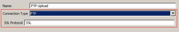
Condition
The Condition tag introduces control statements.
| Attribute | Description | M/O | Default |
|---|---|---|---|
| criteria | Specifies the control statement. Currently “if” and “ifnot” are supported. | M | - |
| property | Specifies a property value to be evaluated. | M | - |
| type | Specifies the type of Condition. Currently only “JRE” is supported. | O | JRE |
| value | Specifies the value of the property. If not specified an attempt is made to get the value of the property. | O | - |
Sample XML\
<ui>
 <Condition criteria="ifnot" property="httphostheader.disabled">
   <group label="HOST_HEADER_GROUP_NAME" columns="2" fill="false">
     <RadioGroupAttribute field="forwardClientHostHeader" columns="2">
       <choice value="1" label="HOST_HEADER_FROM_CLIENT"/>
       <choice value="0" label="HOST_HEADER_FROM_VORDEL" />
     </RadioGroupAttribute>
   </group>
 </Condition> />
</ui>
Rendered UI\
If the “httphostheader” property is not enabled nothing is displayed. If the “httphostheader” property is enabled it renders the following UI:

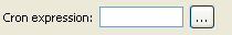
CronAttribute
The CronAttribute tag renders an SWT Button widget and a SWT Text widget, backed by the specified entity field.
| Attribute | Description | M/O | Default |
|---|---|---|---|
| field | Specifies the name of the field of the entity backed by the rendered controls. | M | - |
| label | Specifies a textual label to appear to the left of the Combo. | O | - |
| required | Specifies whether or not the entity field is required. | M | false |
Sample XML\
<ui>
   <CronAttribute field="expression"
    label="CRON_EXPRESSION_DIALOG_EXPRESSION_LABEL"
    required="true"/>
</ui>
Rendered UI\
The above XML renders the following UI:
ContentEncodingAttribute
The ContentEncodingAttribute tag renders an SWT Text widget and a SWT Button widget, backed by the specified entity field.
| Attribute | Description | M/O | Default |
|---|---|---|---|
| field | Specifies the name of the field of the entity backed by the rendered controls. | M | - |
| label | Specifies the ID of the resource containing the text to display on the Label (to the left of the Text box) | O | - |
| trackChanges | Specifies whether or not changes will be tracked when the button state has changed. If set to “true” this will call the trackChange() method on the page on which the button is rendered | O | false |
| span | Value used in the creation of layout data for the Button. Span represents the horizontal span of the following GridData: GridData gridData = new GridData(); |
O | 1 |
| required | Specifies whether or not the entity field is required | O | false |
Sample XML\
<ui>
   <ContentEncodingAttribute field="inputEncodings"
    label="inputEncodings" trackChanges="true"/>
</ui>
Rendered UI\
The above XML renders the following UI:

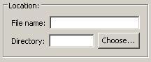
DirectoryChooser
The DirectoryChooser tag renders an SWT Label, Text and Button widget. When clicked, the button displays a directory browser to allow you to easily select a directory.
| Attribute | Description | M/O | Default |
|---|---|---|---|
| label | Text for the label to be displayed | M | - |
| field | Specifies the name of the field of the entity backed by the rendered controls. | M | - |
| span | Value used in the creation of layout data for the Composite. Span represents the horizontal span of the following GridData: GridData gridData = new GridData(); |
O | 1 |
| required | Specifies whether or not the entity field is required | O | false |
Sample XML\
<ui>
 <group label="LOCATION_LABEL" span="2">
  <panel columns="2">
   <TextAttribute field="fileName" label="FILENAME_LABEL" required="true" />
   <DirectoryChooser field="directory" label="DIRECTORY_LABEL" required="true"
    span="2" />
  </panel>
 </group>
</ui>
Rendered UI\
The above XML renders the following UI:
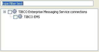
ESPKReferenceSummaryAttribute
The ESPKReferenceSummaryAttribute tag renders an SWT Text and Button control. When clicked, the button displays a reference browser to allow you to easily select the required entity reference.
| Attribute | Description | M/O | Default |
|---|---|---|---|
| label | Specifies the ID of the resource containing the text to display on the Label. | O | - |
| field | Specifies the name of the field of the entity backed by the rendered controls. | M | - |
| required | Specifies whether or not the entity field is required. | O | false |
| dialogTitle | Specifies the ID of the resource containing the text to display on the title bar of the reference browser dialog. | O | - |
| displayName | Specifies the ID of the resource containing the attribute/control name to be displayed in the event of an error. | O | - |
| selectableTypes | Specifies the entity types (as a comma separated list) that are selectable in the TreeViewer displayed in the Reference Selector dialog. | M | - |
| searches | Specifies the entity types (as a comma separated list) that are searchable for entities of those types specified by the “selectableTypes” attribute. | M | - |
Sample XML\
<ui>
 <ESPKReferenceSummaryAttribute
  displayName="EMS_CONSUMER_SELECT_CONNECTION_DISP_NAME"
  field="emsClient"
  searches="EMSClientGroup" selectableType="EMSClient"
  dialogTitle="EMS_CLIENT_DIALOG_TITLE" required="true" span="2" />
</ui>
Rendered UI\
The above XML renders the following UI:

The following dialog is displayed when you click the browse button:
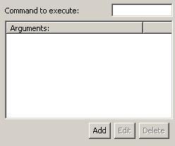
FieldTable
The FieldTable tag renders an SWT TableViewer, along with a bank of buttons to allow you to enter a list of values, the type of which is based on the specified entity field.
| Attribute | Description | M/O | Default |
|---|---|---|---|
| label | Text for the label to be displayed. | M | - |
| field | Specifies the name of the field of the entity backed by the rendered controls. | M | - |
| helpID | Help identifier used for the Add/Edit dialogs associated with the table. | M | - |
| span | Value used in the creation of layout data for the controls. Span represents the horizontal span of the following GridData: GridData gridData = new GridData(); |
O | 2 |
| required | Specifies whether or not the entity field is required. | O | false |
| columnWidth | Specifies the width of the column in the table. | O | 200 |
| addDialogTitle | Specifies the title of the dialog that appears when the ‘Add’ button is clicked. | O | ‘Add’ |
| editDialogTitle | Specifies the title of the dialog that appears when the ‘Edit’ button is clicked. | O | ‘Edit’ |
| labelText | Specifies the text that appears on the label on the Add and Edit dialogs. | O | ‘Value’ |
Sample XML\
<ui>
   <panel columns="2">
     <TextAttribute field="cmdLine" label="CMD_LINE_LABEL" required="true" />
     <FieldTable field="arguments" label="ARGUMENTS_LABEL" />
  </panel>
</ui>
Rendered UI\
The above XML renders the following UI:
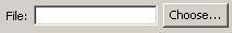
FileChooserText
The FileChooserText tag renders an SWT Label, Text and Button widget. When clicked, the button displays a file browser to allow a user to easily select a file.
| Attribute | Description | M/O | Default |
|---|---|---|---|
| label | Text for the label to be displayed | M | - |
| field | Specifies the name of the field of the entity backed by the rendered controls. | M | - |
| span | Value used in the creation of layout data for the Composite. Span represents the horizontal span of the following GridData: GridData gridData = new GridData(); |
O | 1 |
| required | Specifies whether or not the entity field is required | O | false |
Sample XML\
<ui>
  <panel columns="2">
    <FileChooserText field="fileIn" label="FILE_LABEL" required="true" span="2" />
  </panel>
</ui>
Rendered UI\
The above XML renders the following UI:
group
The group tag renders an SWT Group widget, which is usually used to group other widgets.
| Attribute | Description | M/O | Default |
|---|---|---|---|
| label | Used to give the group a visual name and also employed internally for binding purposes to allow the control and its children to be enabled/disabled. | O | - |
| columns | Value used in the creation of the layout data for the Composite. Columns represent the number of cell columns of the following GridLayout: GridLayout gridLayout = new GridLayout(); |
O | 1 |
| span | Value used in the creation of layout data for the Composite. Span represents the horizontal span of the following GridData: GridData gridData = new GridData(); |
O | 1 |
| margin | Value used in the creation of the layout data for the Composite. Margin specifies the number of pixels to be used for the Composite. It can be specified as a single integer value whereby the following layout members will be set: GridLayout gridLayout = new GridLayout(); Margin can also be specified as a list of 4 integer values, whereby the following layout members will be set: GridLayout gridLayout = new GridLayout(); |
O | 5 |
| fill | Value used in the creation of the layout data for the Composite. Fill specifies that the layout should resize the Composite to fill both horizontally and vertically, and, depending on its parent, should grow horizontally and vertically if the space is available. Fill is usually used in conjunction with “span”. Fill represents the following GridData: GridData gridData = new GridData(); |
O | true |
| verticalSpacing | Value used in the creation of the layout data for the Composite. Specifies the number of pixels from the bottom edge of one cell and the top edge of its neighboring cell underneath: GridLayout gridLayout = new GridLayout(); |
O | 5 |
| indent | Value used in the creation of the layout data for the Composite. Specifies the number of pixels of horizontal margin that will be placed along the left and right edges of the layout. The following layout member will be set: GridLayout gridLayout = new GridLayout(); |
O | 0 |
Sample XML\
<ui>
 <group label="LOG_PAGE_CATEGORY_LABEL" columns="2">
  <CategoryAttribute label="LOG_CATEGORY_LABEL" required="true" />
 </group>
</ui>
Rendered UI\
The above XML renders the following UI:
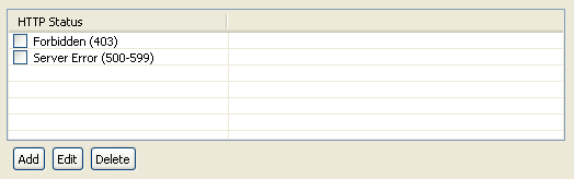
HTTPStatusTableAttribute
The HTTPStatusTableAttribute tag renders a Table and a group SWT Buttons that appear as a Button bar. When clicked, the buttons display a dialog to add, edit, or delete a HTTP status code.
| Attribute | Description | M/O | Default |
|---|---|---|---|
| field | Specifies the name of the field of the entity backed by the rendered controls. | M | - |
| tableHeight | Specifies the preferred height of the control | O | - |
| required | Specifies whether or not the entity field is required | O | false |
Sample XML\
<ui>
  <HTTPStatusTableAttribute field="retryHTTPRanges" tableHeight="100" />
</ui>
Rendered UI\
The above XML renders the following UI:
include
The
| Attribute | Description | M/O | Default |
|---|---|---|---|
| resource | The name of the declarative XML file to be included inline in the declarative parent XML file. | M | |
| class | The class, including package, used to render the included resource. Any required string resources will need to be redefined in the local resource.properties file. |
O |
Sample XML\
<ui>
 <panel columns="2">
  <include resource="AuditSettings-page.xml"
   class="com.vordel.client.manager.AuditSettingsPage"/>
 </panel>
</ui>
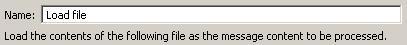
label
The label tag renders an SWT Label widget.
| Attribute | Description | M/O | Default |
|---|---|---|---|
| label | Specifies the ID of the resource containing the text to display on the Label. | M | - |
| span | Value used in the creation of layout data for the Label. Span represents the horizontal span of the following GridData: GridData gridData = new GridData(); |
O | 1 |
| bold | Value used to specify whether or not the font is rendered bold. | O | false |
Sample XML\
<ui>
 <panel columns="2">
  <NameAttribute />
  <label label="FILE_TO_LOAD_SUMMARY" span="2" />
 </panel>
</ui>
Rendered UI\
The above XML renders the following UI:
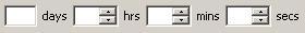
LifeTimeAttribute
The LifeTimeAttribute tag renders a Label, Text, and a group of Spin controls, representing a time span. This allows you to enter values for Days, Hours, Minutes and Seconds.
| Attribute | Description | M/O | Default |
|---|---|---|---|
| label | Specifies the ID of the resource containing the text to display on the Label to the left of all controls | O | - |
| field | Specifies the name of the field of the entity backed by the rendered controls. | M | - |
| required | Specifies whether or not the entity field is required | O | false |
Sample XML\
<ui>
 <panel columns="2">
  <panel span="2" columns="3" margin="0">
   <LifeTimeAttribute label="VALIDITY_LABEL" field="validity" required="true" />
  </panel>
 </panel>
</ui>
Rendered UI\
The above XML renders the following UI:
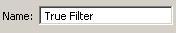
NameAttribute
The NameAttribute tag renders an SWT Label and accompanying Text widget. It is used to wrap the following TextAttribute:
<TextAttribute field="name" label="NAME_LABEL" required="true" />
The label NAME_LABEL must exist in the appropriate resource.properties file.
Sample XML\
<ui>
  <panel columns="2">
    <NameAttribute />
  </panel>
</ui>
Rendered UI\
The above XML renders the following UI:
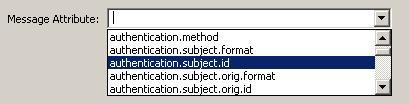
MsgAttrAttribute
The MsgAttrAttribute tag renders an SWT Label and accompanying Combo widget populated with a list of Axway message attributes.
| Attribute | Description | M/O | Default |
|---|---|---|---|
| label | Specifies the ID of the resource containing the text to display on the Label. | M | - |
| field | Specifies the name of the field of the entity backed by the rendered controls. | M | - |
| span | Value used in the creation of layout data for the Composite. Span represents the horizontal span of the following GridData: GridData gridData = new GridData(); |
O | 1 |
| required | Specifies whether or not the entity field is required. | O | false |
Sample XML\
<ui>
 <panel columns="2">
  <MsgAttrAttribute field="sourceAttribute"
   label="STRING_REPLACE_SRC_ATTRIBUTE_LABEL" required="true"/>
 </panel>
</ui>
Rendered UI\
The above XML renders the following UI:
MultiValueTextAttrAttribute
The MultiValueTextAttribute tag is similar to the TextAttribute tag in that it renders an SWT Text widget (and optionally, a Label widget), backed by the specified field for the entity being configured. The difference is that it caters for multiple values interspersed with the specified separator.
| Attribute | Description | M/O | Default |
|---|---|---|---|
| field | Specifies the name of the field of the entity backed by the rendered controls. The default value of the field will automatically appear in the Text widget. |
M | - |
| label | Indicates that a Label should be rendered to the left of the Text widget. The value of this field is set to a resource identifier, specified in a resource.properties file. |
O | - |
| required | Specifies whether or not the field is required. If required and the user does not enter a value, a warning dialog appears, prompting the user to enter a value for the field. | O | - |
| span | Value used in the creation of layout data for the controls that are rendered. If a single-line control is being rendered, the span represents the horizontal span of the following GridData: GridData gridData = new GridData(); If multiline control is being rendered, the span represents the horizontal span of the following GridData: GridData gridData = new GridData(); |
O | 1 |
| split | Specifies the string used as a separator to the list of multiple values. | O | - |
Sample XML\
<ui>
 <panel columns="2">
  <MultiValueTextAttribute field="extension" label="EXTENSION_LABEL"
   required="false" split=";"/>
 </panel>
</ui>
Rendered UI\
The above XML renders the following UI:
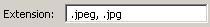
In this case, EXTENSION_LABEL is resolved to the localized string “Extension:”.
NumberAttribute
The NumberAttribute tag renders an SWT Label and accompanying Text widget. The Text widget only accepts numbers as input.
| Attribute | Description | M/O | Default |
|---|---|---|---|
| label | Specifies the ID of the resource containing the text to display on the Label. | M | - |
| field | Specifies the name of the field of the entity backed by the rendered controls. | M | - |
| span | Value used in the creation of layout data for the Composite. Span represents the horizontal span of the following GridData: GridData gridData = new GridData(); |
O | 1 |
| readOnly | Specifies whether or not the Text widget is editable. | O | false |
| min | Specifies the minimum permitted value for the number field. | O | 0 |
| max | Specifies the maximum permitted value for the number field. | O | 100 |
| required | Specifies whether or not the entity field is required. | O | false |
Sample XML\
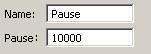
<ui>
 <panel columns="2">
  <NameAttribute />
  <NumberAttribute field="pause" label="PAUSE_FOR_LABEL" required="true" />
 </panel>
</ui>
Rendered UI\
The above XML renders the following UI:
panel
The panel tag renders an SWT Composite widget, which is usually used to group other widgets.
| Attribute | Description | M/O | Default |
|---|---|---|---|
| label | Used internally for binding purposes to allow the control and its children to be enabled/disabled. | O | - |
| columns | Value used in the creation of the layout data for the Composite. Columns represents the number of cell columns of the following GridLayout: GridLayout gridLayout = new GridLayout(); |
O | 1 |
| span | Value used in the creation of layout data for the Composite. Span represents the horizontal span of the following GridData: GridData gridData = new GridData(); |
O | 1 |
| margin | Value used in the creation of the layout data for the Composite. Margin specifies the number of pixels to be used for the Composite. It can be specified as a single integer value whereby the following layout members will be set: GridLayout gridLayout = new GridLayout(); |
O | 5 |
| fill | Value used in the creation of the layout data for the Composite. Fill specifies that the layout should resize the Composite to fill both horizontally and vertically, and, depending on its parent, should grow horizontally and vertically if the space is available. Fill is usually used in conjunction with “span”. Fill represents the following GridData: GridData gridData = new GridData(); |
O | true |
| verticalSpacing | Value used in the creation of the layout data for the Composite. Specifies the number of pixels from the bottom edge of one cell and the top edge of its neighboring cell underneath. GridLayout gridLayout = new GridLayout(); |
O | 5 |
| indent | Value used in the creation of the layout data for the Composite. Specifies the number of pixels of the horizontal margin that will be placed along the left and right edges of the layout. The following layout member will be set: GridLayout gridLayout = new GridLayout(); |
O | 0 |
| horizontalAlignment | Possible values are:
Value used in the creation of the layout data for the Composite. GridData gridData = new GridData(); |
O | SWT.LEFT |
| verticalAlignment | Possible values are:
Value used in the creation of the layout data for the Composite. GridData gridData = new GridData(); |
O | SWT.TOP |
| widthHint | Value used in the creation of the layout data for the Composite.GridData gridData = new GridData(); |
O | |
| heightHint | Value used in the creation of the layout data for the Composite.GridData gridData = new GridData(); |
O | |
| minWidth | Value used in the creation of the layout data for the Composite.GridData gridData = new GridData(); |
O | |
| minHeight | Value used in the creation of the layout data for the Composite.GridData gridData = new GridData(); |
O |
Sample XML\
<ui>
 <panel span=”2” columns="2" indent=”15” margin=”0” label=”SETTINGS_PANEL”>
  <ReferenceSelector field="connectionFailurePolicy"
   type="FilterCircuit"
   label="CONNECTION_FAILURE_POLICY_SELECTION_DIALOG_TITLE"
   title="CHOOSE_CONNECTION_FAILURE_POLICY" />
 </panel>
</ui>
Rendered UI\
The above XML renders the following UI:
Note
The red rectangle is for illustration purposes only.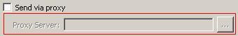
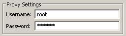
PasswordAttribute
The PasswordAttribute tag renders an SWT Label and accompanying Text widget. The Text widget has its user-entered text masked with the * character.
| Attribute | Description | M/O | Default |
|---|---|---|---|
| label | Specifies the ID of the resource containing the text to display on the Label. | O | - |
| field | Specifies the name of the field of the entity backed by the rendered controls. | M | - |
| span | Value used in the creation of layout data for the Composite. Span represents the horizontal span of the following GridData: GridData gridData = new GridData(); |
O | 1 |
| required | Specifies whether or not the entity field is required. | O | false |
| widthHint | Specifies the preferred width of the control. | O | SWT.DEFAULT |
| heightHint | Specifies the preferred height of the control. | O | false |
| multiline | Specifies whether the control is a multiline Text widget. If this attribute is not present the control defaults to a single-line widget. No masking occurs if this attribute is set to “true”. This restriction is coded in Text.setEchoChar(); |
O | false |
| wrap | Specifies whether the text should wrapped within the control. This attribute is conditional on the multiline attribute being present and set to true. |
O | false |
| vscroll | Specifies whether a vertical scrollbar should be rendered. This attribute is conditional on the multiline attribute being present and set to true. |
C | false |
| hscroll | Specifies whether a horizontal scrollbar should be rendered. This attribute is conditional on the multiline attribute being present and set to true. |
C | false |
Sample XML\
<ui>
 <group label="PROXY_SETTINGS_LABEL" columns="2" span="2">
  <TextAttribute field="username" label="PROXY_USERNAME_LABEL"/>
  <PasswordAttribute field="password" label="PROXY_PASSWORD_LABEL"/>
 </group>
</ui>
Rendered UI\
The above XML renders the following UI:
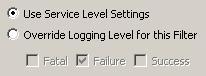
RadioGroupAttribute
The RadioGroupAttribute tag renders an SWT Composite with 0 or more Buttons (style = SWT.RADIO) defined using ‘choice’ tags as children.
RadioGroupAttribute – Available attributes
| Attribute | Description | M/O | Default |
|---|---|---|---|
| field | Specifies the name of the field of the entity backed by the rendered controls. | M | - |
| columns | Value used in the creation of layout data for the Composite. Columns represents the number of cell columns in the layout: GridLayout layout = new GridLayout(); |
O | 1 |
| required | Specifies whether or not the entity field is required. | O | false |
choice – Available attributes
| Attribute | Description | M/O | Default |
|---|---|---|---|
| label | Specifies the ID of the resource containing the text to display on the Label. | M | - |
| value | Specifies one of the possible entity values for the ‘field’ defined in the RadioGroupAttribute tag. This value will be tied to the button, and saved to the Entity if this button is selected. | M | - |
| span | Value used in the creation of layout data for the Button. Span represents the horizontal span of the following GridData: GridData gridData = new GridData(); |
O | 1 |
Sample XML\
The following example represents the “logMaskType” entity field, of which there are two possible values: “SERVICE” and “FILTER”. If the first radio button is selected (represented by the first ‘choice’ tag) the logMaskField will acquire the value “SERVICE”. If the second radio button is selected the logMaskField will acquire the value “FILTER”.
The RadioGroupAttribute tag is not restricted to just having ‘choice’ tags as children. A good candidate is the
<ui>
  <panel>
    <RadioGroupAttribute field="logMaskType" columns="1">
     <choice value="SERVICE" label="USE_SERVICE" />
     <choice value="FILTER" label="USE_FILTER" />
     <panel indent="15" margin="0">
         <BitMaskAttribute field="logMask" columns="3">
        <choice value="1" label="LEVEL_FATAL"/>
        <choice value="2" label="LEVEL_FAILURE"/>
        <choice value="4" label="LEVEL_SUCCESS"/>
         </BitMaskAttribute>
      </panel>
     </RadioGroupAttribute>
  </panel>
</ui>
Rendered UI\
The above XML renders the following UI:
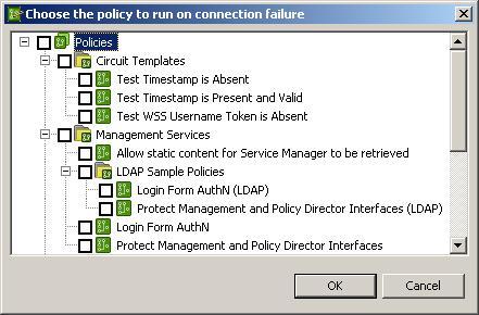
ReferenceSelector
The ReferenceSelector tag renders an SWT Label, Text and Button control. When clicked, the button displays a reference browser to allow you to easily select the required entity reference.
| Attribute | Description | M/O | Default |
|---|---|---|---|
| label | Specifies the ID of the resource containing the text to display on the Label. | O | - |
| field | Specifies the name of the field of the entity backed by the rendered controls. | M | - |
| required | Specifies whether or not the entity field is required. | O | false |
| title | Specifies the ID of the resource containing the text to display on the title bar of the reference browser dialog. | M | - |
| widthHint | Specifies a width hint of reference browser. | O | SWT.DEFAULT |
| displayName | Specifies the ID of the resource containing the attribute or control name to be displayed in the event of an error. | O | - |
| selectableTypes | Specifies the entity types (as a comma separated list) that are selectable in the TreeViewer displayed in the Reference Selector dialog. | M | - |
| searches | Specifies the entity types (as a comma separated list) that are searchable for entities of those types specified by the “selectableTypes” attribute. | M | - |
| trackChanges | Specifies whether or not to track selection changes. | O | false |
Sample XML\
<ui>
 <panel span="2" columns="2" indent="15" margin="0" label="SETTINGS_PANEL">
  <ReferenceSelector field="connectionFailurePolicy"
   selectableTypes="FilterCircuit"
   searches="ROOT_CIRCUIT_CONTAINER,CircuitContainer"
   label="POLICY_SELECTION_DIALOG_TITLE"
   title="CHOOSE_CONNECTION_FAILURE_POLICY" />
 </panel>
</ui>
Rendered UI\
The above XML renders the following UI:

The following dialog is displayed when the browse button is clicked:
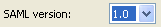
SamlAttribute
The SamlAttribute tag renders a SWT Combo with a list of SAML versions.
| Attribute | Description | M/O | Default |
|---|---|---|---|
| field | Specifies the name of the field of the entity backed by the rendered controls. | O | - |
| label | Specifies the ID of the resource containing the text to display on the Label (to the left of the combo box). | O | - |
| required | Specifies whether or not the entity field is required. | O | false |
Sample XML\
<ui>
 <SamlAttribute label="SAML_VERSION_REQUIRED_LABEL"
  field="samlVersion" required="true" />
</ui>
Rendered UI\
The above XML renders the following UI:
SamlSubjectConfirmationAttribute
The SamlSubjectConfirmationAttribute tag renders a SWT Combo with a list of available SAML subject confirmation methods. The Attribute is very specific to using the SAML filter. You can only have one SamlSubjectConfirmationAttribute per window.
When a SAML assertion is consumed by a downstream web service, the information contained in the SubjectConfirmation block can be used to authenticate the end-user that authenticated to the API Gateway, or the issuer of the assertion, depending on what is configured.
The following table shows the available methods and their meanings :
| Method | Meaning |
|---|---|
| Holder Of Key | The API Gateway includes the key used to prove that the API Gateway is the holder of the key, or it includes a reference to the key. |
| Bearer | The subject of the assertion is the bearer of the assertion. |
| SAML Artifact | The subject of the assertion is the user that presented a SAML Artifact to the API Gateway. |
| Sender Vouches | Use this confirmation method to assert that the API Gateway is acting on behalf of the authenticated end user. No other information relating to the context of the assertion is sent. It is recommended that both the assertion and the SOAP Body are signed if this option is selected. If the Method field is blank then no ConfirmationMethod block is inserted into the assertion. |
Note
The entity field defaults to “subjectConfirmationMethod”.| Attribute | Description | M/O | Default |
|---|---|---|---|
| label | Specifies the ID of the resource containing the text to display on the Label | O | - |
| required | Specifies whether or not the entity field is required. | M | - |
| span | Value used in the creation of layout data for the Combo. Span represents the horizontal span of the following GridData: GridData gridData = new GridData(); |
O | 1 |
| columns | Value used in the creation of the layout data for the Composite. Columns represents the number of cell columns of the following GridLayout: GridLayout gridLayout = new GridLayout(); |
O | 2 |
Sample XML\
<ui>
  <SamlSubjectConfirmationAttribute label="SAML_SUBJECT_CONF_METHOD_LABEL"
   required="true" />
</ui>
Rendered UI\
The above XML renders the following UI:

scrollpanel
The scrollpanel tag renders an SWT ScrolledComposite widget. When rendered the control automatically calculates the extent of its children so that the scroll bars are rendered correctly.
To facilitate ease-of-use, one of the following tags must be a direct child of scrollpanel:
- panel
- group
- tabFolder
| Attribute | Description | M/O | Default |
|---|---|---|---|
| label | Used internally for callback purposes to allow the extents of the scrollpanel to be set correctly. | M | - |
| widthHint | Value used in the creation of the layout data for the Composite:GridData gridData = new GridData(); |
O | |
| heightHint | Value used in the creation of the layout data for the Composite:GridData gridData = new GridData(); |
O | |
| minWidth | Value used in the creation of the layout data for the Composite:GridData gridData = new GridData(); |
O | |
| minHeight | Value used in the creation of the layout data for the Composite:GridData gridData = new GridData(); |
O |
Sample XML\
<ui>
 <scrollpanel>
  <panel columns="2">
    <TextAttribute field="name" label="EXCEPTION_NAME" required="true" />
    <TextAttribute field="name" label="EXCEPTION_NAME" required="true" />
    <TextAttribute field="name" label="EXCEPTION_NAME" required="true" />
    <TextAttribute field="name" label="EXCEPTION_NAME" required="true" />
    <TextAttribute field="name" label="EXCEPTION_NAME" required="true" />
    <TextAttribute field="name" label="EXCEPTION_NAME" required="true" />
  </panel>
 </scrollpanel>
</ui>
Rendered UI\
The above XML renders the following UI:
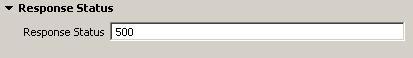
section
The section tag renders an SWT ExpandableComposite widget, which allows for groups of controls to be expanded or hidden from view.
To facilitate ease-of-use, one of the following tags must be a direct child of section:
- panel
- group
- tabFolder
| Attribute | Description | M/O | Default |
|---|---|---|---|
| label | Specifies the text heading of the section. | M | - |
| expanded | Specifies whether or not the section is expanded. | O | false |
Sample XML\
<ui>
 <section label="RS_STATUS_LABEL" expanded="true">
  <panel columns="2">
   <TextAttribute field="name" label="RS_STATUS_LABEL" required="true" />
  </panel>
 </section>
</ui>
Rendered UI\
The above XML renders the following UI:
The section can also be collapsed as follows:

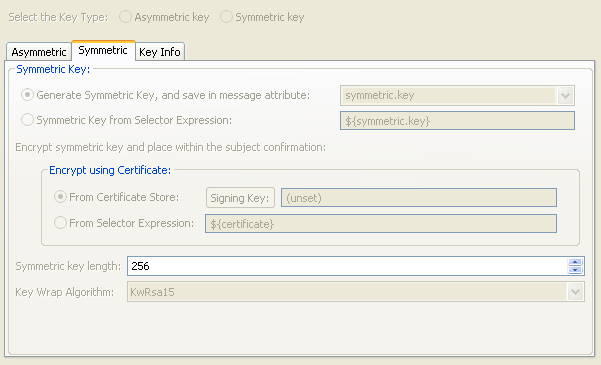
SigningKeyAttribute
The SigningKeyAttribute tag renders a SWT Radio Button and a Tab Folder which has three tabs whose content includes SWT Buttons, Radio Buttons, Combo boxes, and so on.
| Attribute | Description | M/O | Default |
|---|---|---|---|
| subjectConfirmationNote | Specifies whether a generic signing panel is displayed or a specific SAML signing panel is displayed. By default the generic signing panel is displayed. | O | false |
| label | Specifies the ID of the resource containing the text to display on the Label. | O | - |
| required | Specifies whether or not the entity field is required. | O | false |
Sample XML\
<ui>
  <SigningKeyAttribute
   subjectConfirmationNote="SUBJECT_CONFIRMATION_ASYMMETRIC_NOTE_LABEL"
   required="false"/>
</ui>
Rendered UI\
The above XML renders the following UI:
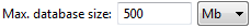
SizeAttribute
The SizeAttribute tag renders an SWT Label (optional), Text, and Combo widgets, allowing you to specify a numeric size value, and select one of the following age types:
- Kb
- Mb
- Gb
Note
The value that is persisted to the underlying entity is stored as bytes.| Attribute | Description | M/O | Default |
|---|---|---|---|
| field | Specifies the name of the field of the entity backed by the rendered controls. | M | - |
| label | Specifies the ID of the resource containing the text to display on the Label. | O | - |
| span | Value used in the creation of layout data for the Button. Span represents the horizontal span of the following GridData: GridData gridData = new GridData(); |
O | 1 |
| required | Specifies whether or not the entity field is required. | O | false |
Sample XML\
<ui>
 <panel columns="3" margin="0">
   <SizeAttribute field="maxDbSize" label="OPDB_MAX_DB_SIZE_LABEL" required="true"/>
 </panel>
</ui>
Rendered UI\
The above XML renders the following UI:
SoftRefListAttribute
The
| Attribute | Description | M/O | Default |
|---|---|---|---|
| field | Specifies the name of the field of the entity backed by the rendered controls. | M | - |
| label | Specifies the ID of the resource containing the text to display on the Label. | O | - |
| refName | Specifies Field value of the referenced entity that is displayed in the Combo box. | M | - |
| displayName | Specifies the name of the SoftRefListAttribute to be displayed in the event of an error. | O | - |
| src | Specifies the Shorthand Key to get the list of referenced entities of a particular type. | M | - |
| required | Specifies whether or not the entity field is required. | M | false |
Sample XML\
<ui>
 <SoftRefListAttribute label="WS_USERNAME_TOKEN_REPOSITORY_NAME_LABEL"
  field="repository" refName="name"
  src="/[AuthnRepositoryGroup]name=Authentication Repositories/[AuthnRepositoryBaseGroup]allowedFilter=WsUsernameFilter/[AuthnRepositoryBase]" />
</ui>
Rendered UI\
The above XML renders the following UI:

SoftRefTreeAttribute
The SoftRefTreeAttribute renders a jFace TreeViewer that shows the policies of a certain type.
| Attribute | Description | M/O | Default |
|---|---|---|---|
| field | Specifies the name of the field of the entity backed by the rendered controls. | M | - |
| searches | Comma separated list of Portable ESPKs. It will then display all the entities represented by each Portable ESPK. | M | - |
| selectableTypes | Specifies the type of entities that are selectable. | M | - |
| displayName | Specifies the name of the SoftRefTreeAttribute to be displayed in the event of an error. | O | - |
| span | Value used in the creation of layout data for the controls that are rendered.GridData gridData = new GridData(GridData.FILL_BOTH); |
O | 1 |
| width | Specifies the preferred width of the control. | O | 300 |
| height | Specifies the preferred height of the control. | O | 300 |
Sample XML\
<ui>
 <panel columns="2">
  <group label="POP_POLICY_LABEL" span="1" columns="1">
   <SoftRefTreeAttribute field="filterCircuit"
    searches="/[CircuitContainer]**/[FilterCircuit],/[FilterCircuit]"
    selectableType="FilterCircuit"
    displayName="POP_CIRCUIT_DISP_NAME"
    height="80"
    width="100"
   />
  </group>
 </panel>
</ui>
Rendered UI\
The above XML renders the following UI:
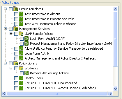
In this case, POP_POLICY_LABEL is resolved to the localized string “Policy to use”.
SpinAttribute
The SpinAttribute tag renders an SWT Text widget (and optionally, a Label widget), along with two buttons, one for incrementing the current entity value, and one for decrementing the value.
| Attribute | Description | M/O | Default |
|---|---|---|---|
| field | Specifies the name of the field of the entity backed by the rendered controls. The default value of the field will automatically appear in the Text widget. |
M | - |
| label | Specifies the ID of the resource containing the text to display on the Label (to the left of the spin control). | O | - |
| required | Specifies whether or not the field is required. If required and the user doesn’t enter a value, a warning dialog will appear, prompting the user to enter a value for the field. | O | - |
| rangeMin | Specifies the minimum value for the permitted range for the entity value. rangeMax must also be present for the range to be set correctly. | C | - |
| rangeMax | Specifies the maximum value for the permitted range for the entity value. rangeMin must also be present for the range to be set correctly. | C | |
| unitLabel | Additional label to appear to the right of the spin control. Specifies the ID of the resource containing the text to display on the Label. | O | - |
Sample XML\
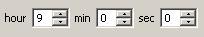
<ui>
 <panel columns="7">
  <SpinAttribute field="hrs" label="HOUR" required="true"
   rangeMin="0" rangeMax="23" />
  <SpinAttribute field="mins" label="MIN" required="true"
   rangeMin="0" rangeMax="59" />
  <SpinAttribute field="secs" label="SEC" required="true"
   rangeMin="0" rangeMax="59" />
 </panel>
</ui>
Rendered UI\
The above XML renders the following UI:
tab
The tab tag renders an SWT TabItem widget. They must be direct children of the tabFolder.
| Attribute | Description | M/O | Default |
|---|---|---|---|
| label | Specifies the ID of the resource containing the text to display on the TabItem. | M | - |
Sample XML\
<ui>
 <panel columns="2" span="2">
  <tabFolder span="2">
   <tab label="CERTS">
   <tab label="SSL">
 </panel>
</ui>
Rendered UI\
The above XML renders the following UI:
tabFolder
The tabFolder tag renders an SWT TabFolder widget used to house TabItems (generated by using tab tags as children).
| Attribute | Description | M/O | Default |
|---|---|---|---|
| span | Value used in the creation of layout data for the controls that are rendered.GridData gridData = new GridData(); |
O | 1 |
Sample XML\
<ui>
 <panel columns="2" span="2">
  <tabFolder span="2">
   <tab label="CERTS">
   <tab label="SSL">
 </panel>
</ui>
Rendered UI\
The above XML renders the following UI:
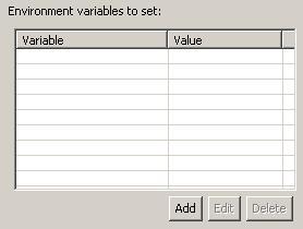
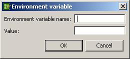
TablePage
The TablePage tag renders a jFace TableViewer that represents a list of entities of the specified type. These entities can be added, edited, and deleted using the available buttons.
| Attribute | Description | M/O | Default |
|---|---|---|---|
| type | Specifies the type of the entity that is represented by the table. | M | - |
| dialogClass | Specifies the full name of the Java class used to implement the dialog employed to add/edit items in the table. | M | - |
| columnProperties | Specifies a comma-separated list of entity fields to be displayed in table columns. | M | - |
| sortColumns | Specifies a comma-separated list of columns to make sortable. | M | - |
| columnResources | Specifies a comma-separated list of resource IDs (from a resource.properties file) that resolve to the text to be displayed on the table columns. |
M | - |
| columnWidths | Specifies a comma-separated list of column widths. | M | - |
| deleteText | Specifies the resource ID that resolves to the text to be displayed to the user when an item from the table is about to be deleted. | M | - |
| span | Value used in the creation of layout data for the controls that are rendered.GridData gridData = new GridData(); |
O | 1 |
| dialog.setFlavor | Specifies a declarative XML file to use to construct the dialog used to add or edit the entities for this table. | O | - |
| tableHeight | Specifies the preferred height of the control. | O | SWT.DEFAULT |
Sample XML\
<ui>
 <panel columns="2">
  <TablePage type="Property"
   dialogClass="com.vordel.client.manager.filter.exec.EnvironmentVariableDialog"
   columnProperties="name,value" sortColumns="name,value"
   columnResources="COLUMN_VARIABLE,COLUMN_VALUE" columnWidths="300,200"
   deleteText="DELETE_VARIABLE_CONFIRMATION"
   dialog.setFlavor="environment_variable_dialog.xml" />
 </panel>
</ui>
Sample dialog flavor XML
<panel columns="2">
 <TextAttribute field="name" label="NAME_LABEL" required="true"/>
 <TextAttribute field="value" label="VALUE_LABEL" required="false"/>
</panel>
Rendered UI\
The above XML renders the following UI:
The dialog is rendered as follows:
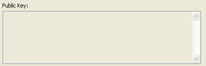
text
The text tag renders an SWT Text widget.
| Attribute | Description | M/O | Default |
|---|---|---|---|
| label | Specifies the ID of the resource containing the text to display on the Label. | O | - |
| multiline | Specifies whether the control is a multiline Text widget. If this attribute is not present the control defaults to a single-line widget. |
O | false |
| wrap | Specifies whether the text should be wrapped within the control. This attribute is conditional on the multiline attribute being present and set to true. |
C | false |
| readOnly | Specifies whether or not the Text widget is read-only. | O | - |
| span | Value used in the creation of layout data for the controls that are rendered. If a single-line control is being rendered, span represents the horizontal span of the following GridData: GridData gridData = new GridData(); If a multiline control is being rendered, span represents the horizontal span of the following GridData: GridData gridData = new GridData(); |
O | 1 |
| widthHint | Specifies the preferred width of the control. | O | SWT.DEFAULT |
| heightHint | Specifies the preferred height of the control. | O | SWT.DEFAULT |
| vscroll | Specifies whether a vertical scroll bar should be rendered. This attribute is conditional on the multiline attribute being present and set to true. |
C | - |
| hscroll | Specifies whether a horizontal scroll bar should be rendered. This attribute is conditional on the multiline attribute being present and set to true. |
C | - |
Sample XML\
<ui>
 <text label="KEYPAIRS_PUBLICKEY_LABEL" multiline="true" vscroll="true"
  wrap="true" heightHint="100" widthHint="350" readOnly="true"/>
</ui>
Rendered UI\
The above XML renders the following UI:
TextAttribute
The TextAttribute tag renders an SWT Text widget (and optionally, a Label widget), backed by the specified field for the entity being configured.
| Attribute | Description | M/O | Default |
|---|---|---|---|
| field | Specifies the name of the field of the entity backed by the rendered controls. The default value of the field will automatically appear in the Text widget. |
M | - |
| label | Indicates that a Label should be rendered to the left of the Text widget. The value of this field is set to a resource identifier, specified in a resources.properties file. |
O | - |
| readOnly | Specifies whether or not the Text widget is read-only. | O | - |
| required | Specifies whether or not the field is required. If required and the user does not enter a value, a warning dialog appears, prompting the user to enter a value for the field. | O | - |
| span | Value used in the creation of layout data for the controls that are rendered. If a single-line control is being rendered, span represents the horizontal span of the following GridData: GridData gridData = new GridData(); If multiline control is being rendered, span represents the horizontal span of the following GridData:GridData gridData = new GridData(); gridData.horizontalAlignment = GridData.FILL; gridData.verticalAlignment = GridData.FILL; gridData.grabExcessHorizontalSpace = true; gridData.grabExcessVerticalSpace = true; gridData.horizontalSpan = colSpan; |
O | 1 |
| widthHint | Specifies the preferred width of the control. | O | SWT.DEFAULT |
| heightHint | Specifies the preferred height of the control. | O | SWT.DEFAULT |
| multiline | Specifies whether the control is a multiline Text widget. If this attribute is not present the control defaults to a single-line widget. |
O | false |
| wrap | Specifies whether the text should be wrapped within the control. This attribute is conditional on the multiline attribute being present and set to true. |
C | false |
| vscroll | Specifies whether a vertical scroll bar should be rendered. This attribute is conditional on the multiline attribute being present and set to true. |
C | false |
| hscroll | Specifies whether the a horizontal scrollbar should be rendered. This attribute is conditional on the multiline attribute being present and set to true. |
C | false |
Sample XML\
<ui>
 <panel columns="2">
  <TextAttribute field="name" label="EXCEPTION_NAME" required="true" />
 </panel>
</ui>
Rendered UI\
The above XML renders the following UI:

In this case, EXCEPTION_NAME is resolved to the localized string “Name:”.
ui
The ui tag is the root of a declarative XML document.
This tag does not require any attributes.
Sample XML\
<ui>
 <panel columns="2">
  <TextAttribute field="name" label="EXCEPTION_NAME" required="true" />
 </panel>
</ui>
validator
The validator tag is used to include a validator class.
| Attribute | Description | M/O | Default |
|---|---|---|---|
| class | Specifies the full name of the Java class used to validate input. | M | - |
Sample XML\
<ui>
 <validator class="com.vordel.client.manager.filter.dirscan.DirectoryScannerDialogValidator" />
</ui>
XPathAttribute
The XPathAttribute tag renders an SWT Combo widget and three SWT Button widgets within an SWT Composite displayed as a Button bar.
| Attribute | Description | M/O | Default |
|---|---|---|---|
| field | Specifies the name of the field of the entity backed by the rendered controls. | M | - |
| xpathGroup | Specifies the entity type of all XPath expressions to be displayed. | M | - |
| label | Specifies the ID of the resource containing the text to display on the Label (to the left of the combo box). | O | - |
| required | Specifies whether or not the entity field is required. | O | false |
| span | Value used in the creation of layout data for the Button. Span represents the horizontal span of the following GridData: GridData gridData = new GridData(); |
O | 1 |
Sample XML\
<ui>
 <XPathAttribute field="insertTokenLocationXPath"
  xpathGroup="XPathTokenInsertionLocationGroup" />
</ui>
Rendered UI\
The above XML renders the following UI: