Define custom filter user interfaces
4 minute read
Declarative XML is a user interface markup language that is used to define UI elements and bindings, allowing you to quickly create dialogs within Policy Studio with minimal coding.
The defined UI elements map to Eclipse SWT (Standard Widget Toolkit) widgets and Axway ScreenAttributes (groups of SWT widgets backed by entity instances).
All declarative XML files start and end with a <ui> element. Each element has a field attribute that corresponds to a field definition in the type definition, and a label attribute that corresponds to a localization key in the resources.properties file.
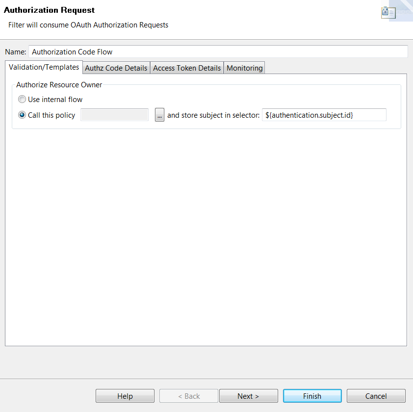
The following is an example of a dialog in Policy Studio:
The following sections describe how the declarative UI XML file for this dialog is loaded within a Policy Studio class, and detail the declarative XML file that defines the dialog.
Note
This dialog and the following code are for demonstration purposes only and might not reflect the current settings for this filter in Policy Studio.Load the declarative XML file
The following code demonstrates how to load the declarative XML file within the Policy Studio class.
package com.vordel.client.manager.filter.oauth2.provider.authorize;

import org.eclipse.swt.widgets.Composite;
import com.vordel.client.manager.wizard.VordelPage;

public class OAuthAuthorizationRequestPage extends VordelPage {
    public OAuthAuthorizationRequestPage() {
        super ("ExampleFilterPage");
        setTitle(“Put the title here”);
        setDescription(“Put the description here"));
        setPageComplete(true);
    }

    @Override
    public void createControl(Composite parent) {
        Composite container =
          render(parent, getClass().getResourceAsStream("declarative.xml"));
        setControl(container);
    }

    ...
}
Declarative XML file
The following declarative.xml file defines the dialog in Policy Studio.
<ui>
  <panel columns="2" span="2">
    <NameAttribute />
    <tabFolder span="2">
      <tab label="OAUTH_APPLICATION_VALIDATION">
        <panel>
          <panel columns="2" fill="false">
            <TextAttribute field="kpsAlias"
              label="OAUTH_USE_KPS"
              required="true" />
          </panel>
          <group label="OAUTH_AUTHORIZATION_REQUEST_AUTHN" fill="false">
            <RadioGroupAttribute field="authNWith" columns="4">
              <choice value="INTERNAL_AUTHN_FLOW"
                label="USE_INTERNAL_FLOW" span="4" />
              <choice value="CIRCUIT_FLOW"
                label="OAUTH_AUTHORIZATION_REQUEST_AUTHN_USE_CIRCUIT" />
              <panel margin="1" columns="4" span="2" fill="false">
                <ReferenceSelector field="circuitPK"
                  selectableTypes="FilterCircuit"
                  searches="ROOT_CIRCUIT_CONTAINER,CircuitContainer"
                  title="OAUTH_AUTHORIZATION_REQUEST_AUTHN_SELECT_CIRCUIT" />
                <TextAttribute field="subjectAttr"
                  label="OAUTH_AUTHORIZATION_REQUEST_AUTHN_SELECTOR" />
              </panel>
            </RadioGroupAttribute>
          </group>
        </panel>
      </tab>
      <tab label="OAUTH_AUTHZ_CODE_GENERATION">
        <panel>
          <panel columns="3" fill="false">
            <ReferenceSelector field="authzCodeCache"
              selectableTypes="AuthzCodePersist"
              searches="OAuth2StoresGroup,AuthzCodeStoreGroup"
              label="OAUTH_AUTHORIZATION_REQUEST_STORE_CODE"
              title="OAUTH_AUTHORIZATION_REQUEST_CHOOSE_CACHE"
              required="true" />
          </panel>
          <panel columns="2" fill="false">
            <TextAttribute field="accessCodeTemplateLocation"
              label="ACCESS_CODE_TEMPLATE_LOCATION"
              required="true" />
          </panel>
          <group label="OAUTH_AUTHORIZATION_REQUEST_GENERATE_CODE"
            columns="4" fill="false">
            <NumberAttribute field="authzCodeLength"
              label="AUTHZ_CODE_LENGTH"
              required="true" min="10" />
            <NumberAttribute field="authzCodeExpiresInSecs"
              label="AUTHZ_CODE_EXPIRES_SECS"
              required="true" max="60O" />
          </group>
        </panel>
      </tab>
      <tab label="OAUTH_ACCESS_TOKEN_GENERATION">
        <scrollpanel>
          <panel>
            <include resource="accesstokengenerationtemplate.xml" />
            <include resource="refreshtokentemplate.xml" />
            <include resource="scopestemplate.xml" />
          </panel>
        </scrollpanel>
      </tab>

      ...

    </tabFolder>
  </panel>
</ui>
This section describes some of the elements declared in the preceding XML file. For a complete listing of all the UI elements and bindings available, see Declarative UI reference.
This declarative XML file declares that the main panel of the dialog spans two columns. All the labels are obtained from the associated resources.properties file.
The <panel> tag renders an SWT Composite widget, which is usually employed to group other widgets.
The <NameAttribute> tag renders an SWT Label and accompanying Text widget. A NAME label must exist in the appropriate resources.properties file.
The <tabFolder> and <tab> attributes produce a tab folder with tabs using the labels supplied.
In the first tab it creates a text box and a group of two radio buttons. Beside the second radio button it creates a <ReferenceSelector>. The <ReferenceSelector> tag renders an SWT Label, Text, and Button control. When clicked, the button displays a reference browser to allow the user to easily select the required entity reference. The following table shows the main <ReferenceSelector> tag attributes.
| Name | Description |
|---|---|
selectableTypes |
Specifies the entity types (as a comma separated list) that are selectable in the TreeViewer displayed in the Reference Selector dialog. |
searches |
Specifies the entity types (as a comma separated list) that are searchable for entities of those types specified by the selectableTypes attribute. |
After the <ReferenceSelector>, it creates another text box to store the subject.
In the second tab it creates another <ReferenceSelector>, followed by a text box and a group of two <NumberAttribute> tags. The <NumberAttribute> tags render an SWT Label and accompanying Text widget. The Text widget only accepts numbers as input.
The third tab includes a <scrollpanel> tag. The <scrollpanel> tag renders an SWT ScrolledComposite widget. When rendered, the control automatically calculates the extent of its children so that the scroll bars are rendered correctly.
One of the following tags must be a direct child of <scrollpanel>:
<panel><group><tabFolder>
For the Access Token Details tab it uses the <panel> tag. It also uses the <include> tag that allows another declarative XML file to be included inline in the parent including XML file.
For the remaining tabs it uses the <include> tag but introduces a new <ButtonAttribute> tag in the fourth tab. The <ButtonAttribute> tag renders an SWT Button widget with the SWT.PUSH style applied, backed by the specified entity field.